At Overture London, I contributed to shaping brands within the legal sector, working with one of the UK’s leading brand agencies specialising in law. My role involved developing visual identities, creating design systems, and producing print and digital collateral that aligned with each client’s brand strategy. Collaborating closely with strategists and writers, I helped translate complex ideas into clear, impactful visuals that strengthened brand positioning. Projects ranged from identity design and marketing materials to large-scale publications and digital assets, always with a focus on clarity, precision, and long-term sustainability.
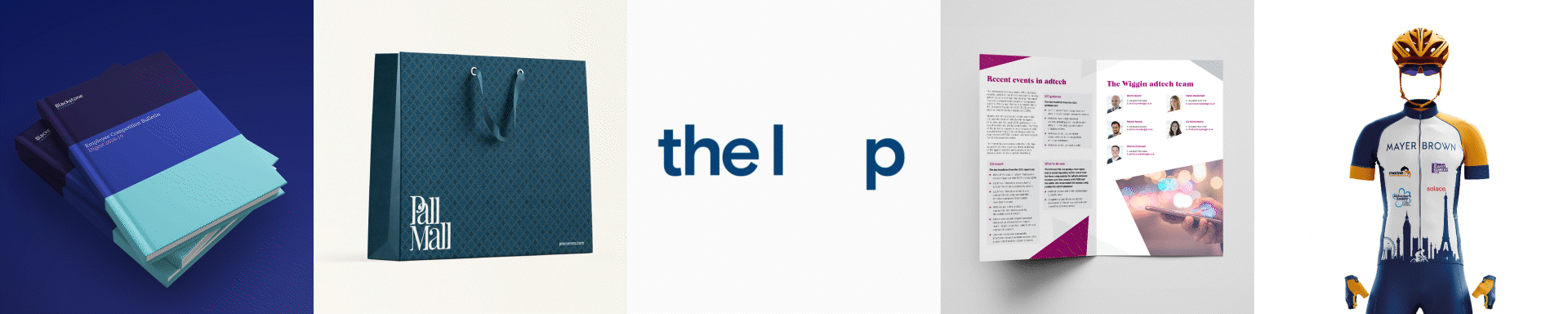
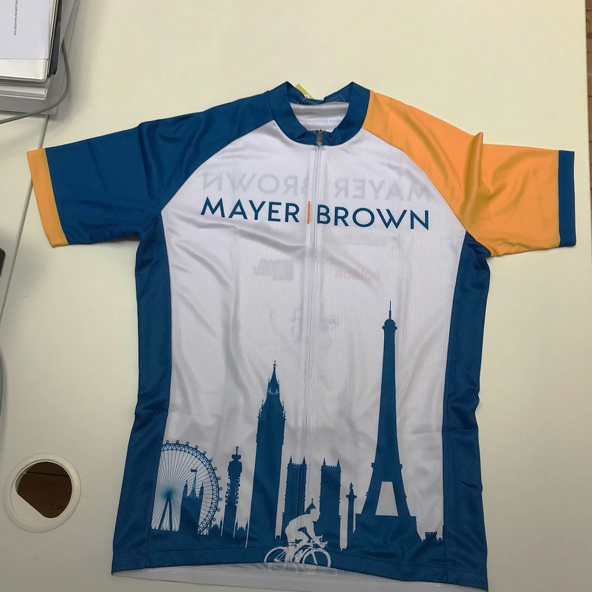
Cycle kit
I designed a bespoke cycle kit for Mayer Brown, translating the firm’s brand identity into a functional and visually cohesive garment. The design applied the brand’s colour palette and graphic elements to create a sleek, professional kit that performs on the road while reinforcing brand recognition. The project demonstrates a balance of technical performance and thoughtful, on-brand design.


Blackstone Chambers
I designed a layout system that incorporated the brand’s colours and imagery, applying the Blackstone Chambers palette on the front and back covers and using a grid system to structure the text with clarity and precision.


RWE & Innogy
I designed a series of pension booklets for RWE and Innogy, focusing on making complex financial information clear, approachable, and engaging. By applying each brand’s visual identity, I developed layouts that balanced clarity with visual interest, ensuring key details were easy to navigate while maintaining a professional and trustworthy tone. The result was a set of cohesive, on-brand materials that supported effective employee communication..


Pall mall
I created branded tote bags and a takeaway booklet for Pall Mall that brought the brand into everyday life. The totes doubled as both practical accessories and bold brand statements, while the booklet offered a concise, portable way to engage with key messages. Together, they delivered a fresh, memorable touchpoint that blended function with style.

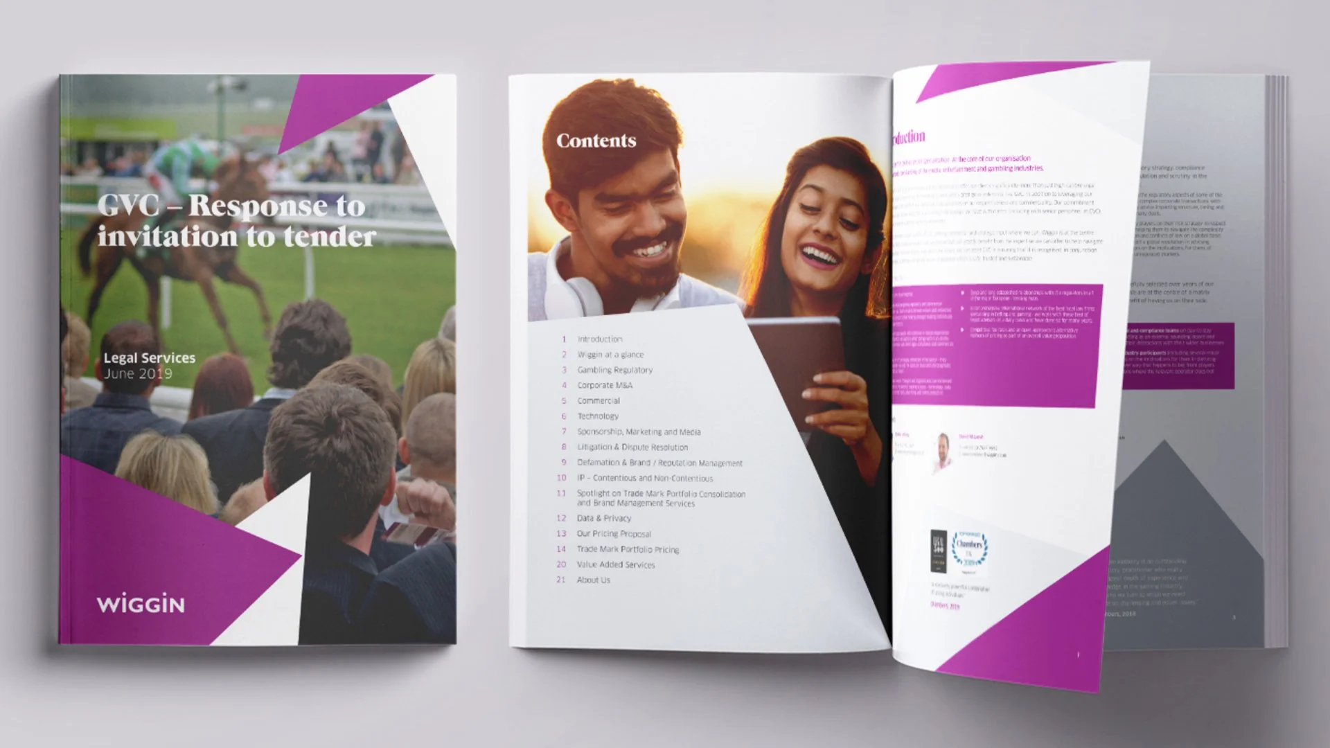
Wiggin
Designed a tender booklet, tri-fold, and two-pager that combined Wiggin’s brand identity with clear layouts, ensuring information was presented professionally and with impact.


Mayer Brown
Created a clean, distinctive app icon for Mayer Brown that combines brand identity with clarity and recognisability across digital platforms.